Design >
Chalk VC UI/UX
Chalk VC is a student-run venture capital firm started in 2021. I was brought on by a collegue of mine to be the creative director where I would oversee the brand identity, fill any design holes we had, and collaborate on the user interface of our website with another member.
The Goal:
Create a stunning brand identity and more importantly, an excellent website that was professional, techy, but still young and vibrant like the founding members.
The Palette
For the palette we set on a group of colors that fell in line with the aesthetics of deep tech while still having some young elements that one would expect from a student-run startup.
![]()
For the palette we set on a group of colors that fell in line with the aesthetics of deep tech while still having some young elements that one would expect from a student-run startup.

Wireframes
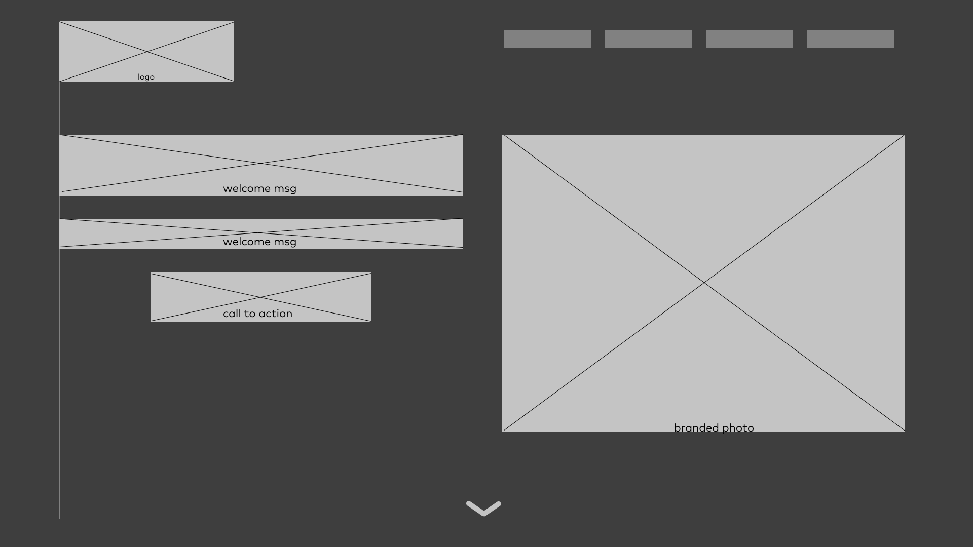
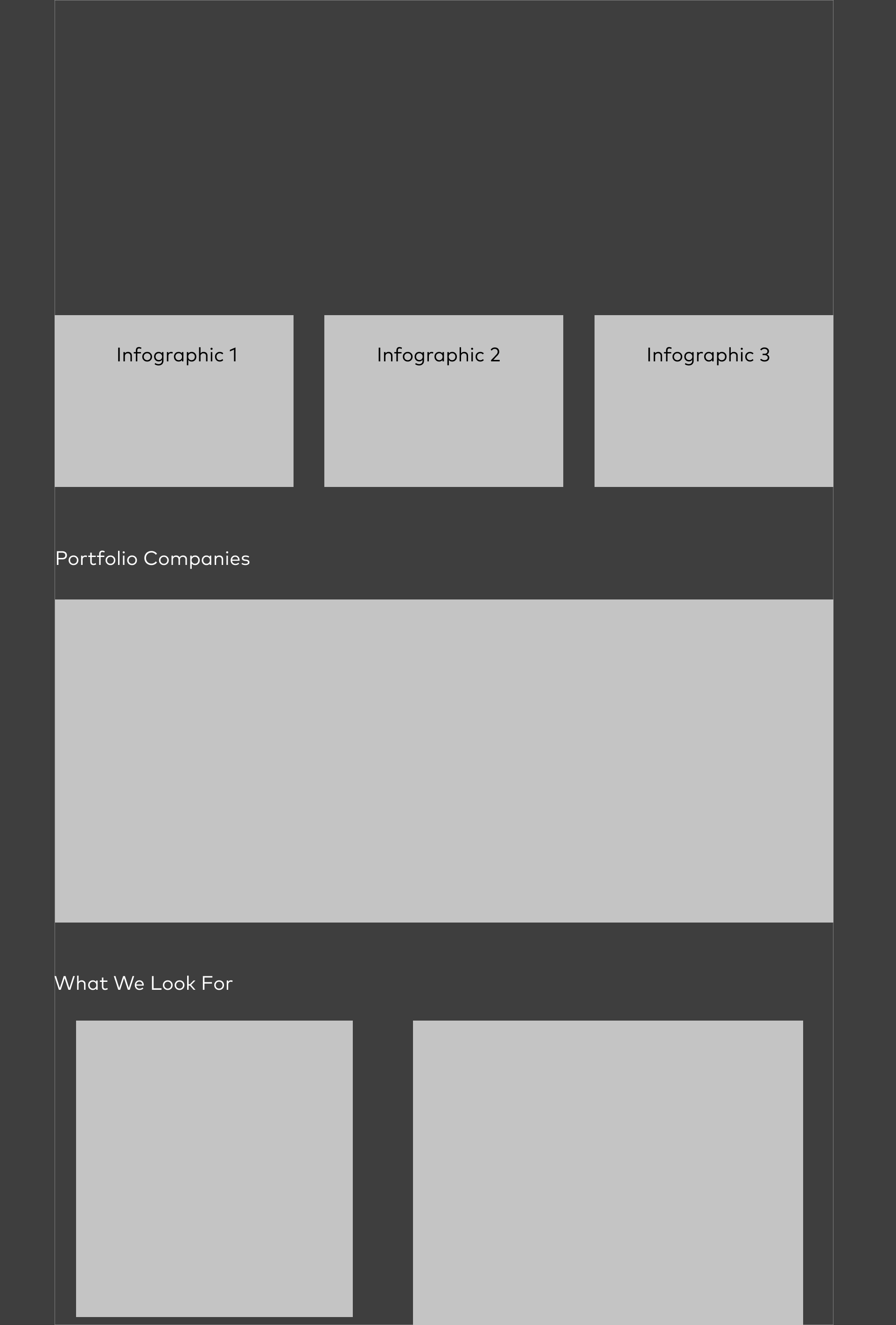
Our wireframes show how the initial goal was to be image heavy and keep text to a minimum, a sentiment that was mostly retained in the final rounds however much of the clutter was removed.
Landing page(desktop)
![]()
Page 1(desktop)
![]()
Page 2(desktop)
![]()
Our wireframes show how the initial goal was to be image heavy and keep text to a minimum, a sentiment that was mostly retained in the final rounds however much of the clutter was removed.
Landing page(desktop)
Page 1(desktop)

Page 2(desktop)
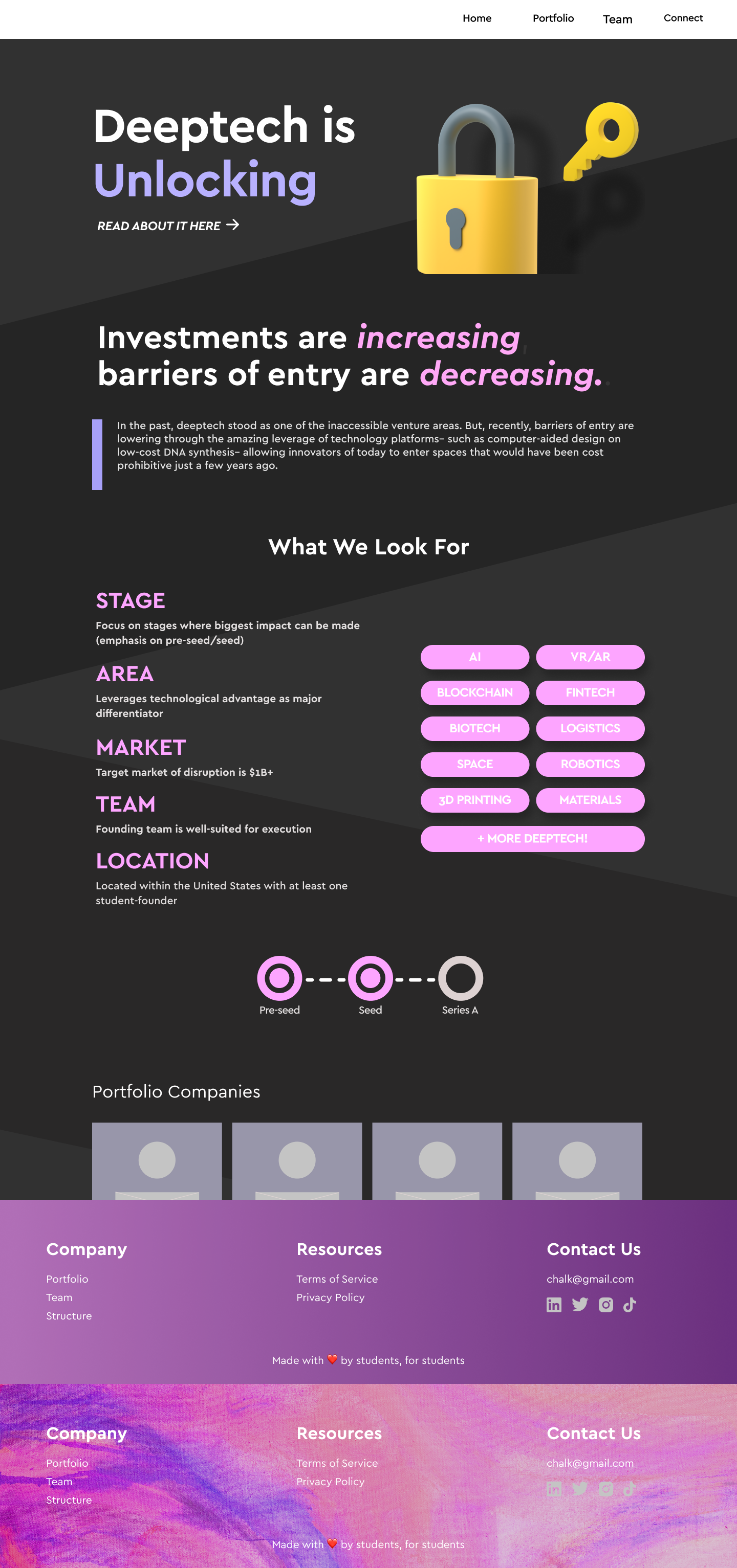
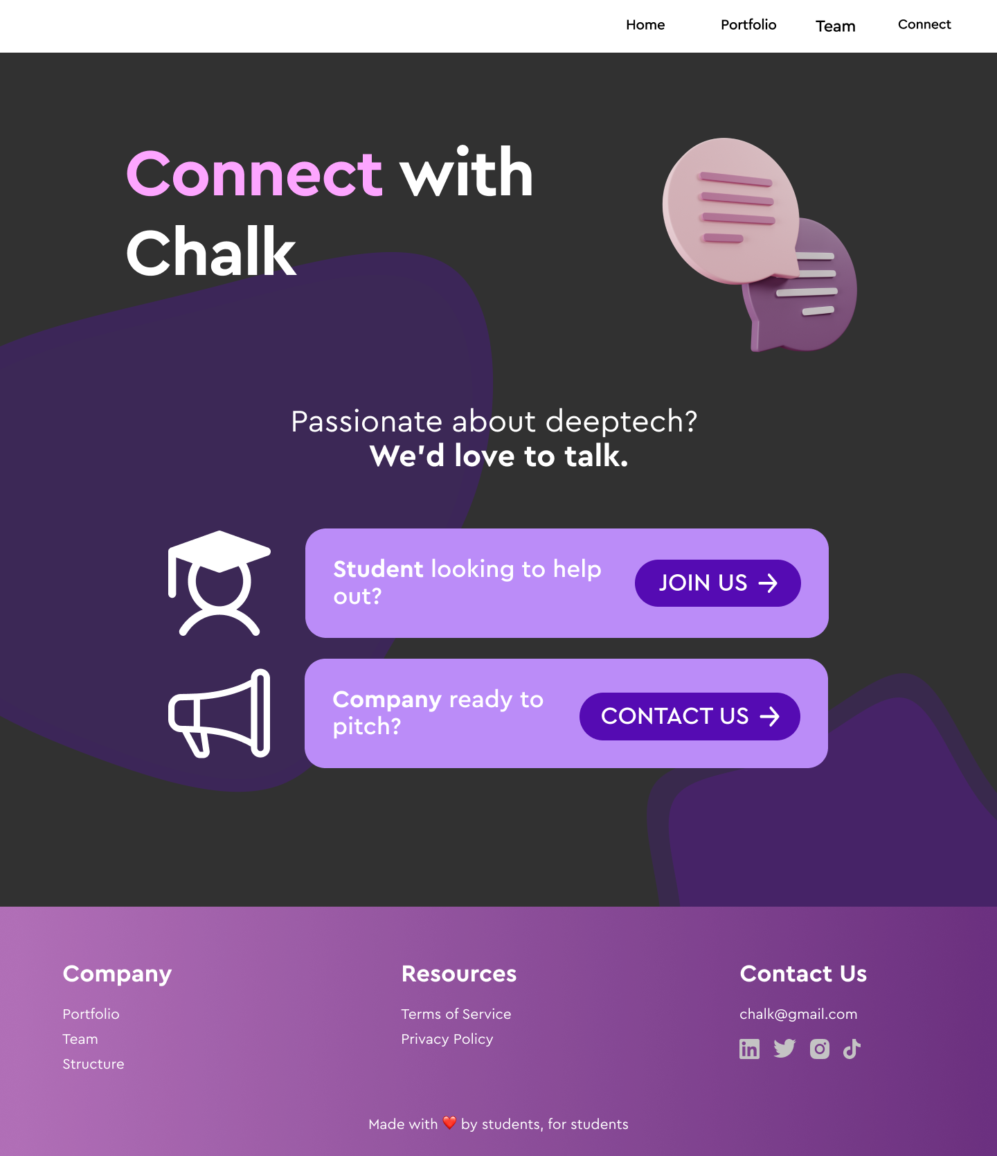
Lo-Fi Prototype
The lo-fi prototype set a strong base for the rest of the website’s UI. Our key information is easy to find and can all be found with a simple scroll. We intended for there to be some sort of interactive element in the landing page with some sort of wave effect as well as expand upon some our hand drawn assets to be fun and inviting. After some cleaning up around the edges our website would start to meet some of the standards we set.
Landing page(desktop)
![]()
Page 1(desktop)
![]()
Connect with us(desktop)
![]()
The lo-fi prototype set a strong base for the rest of the website’s UI. Our key information is easy to find and can all be found with a simple scroll. We intended for there to be some sort of interactive element in the landing page with some sort of wave effect as well as expand upon some our hand drawn assets to be fun and inviting. After some cleaning up around the edges our website would start to meet some of the standards we set.
Landing page(desktop)

Page 1(desktop)
Connect with us(desktop)
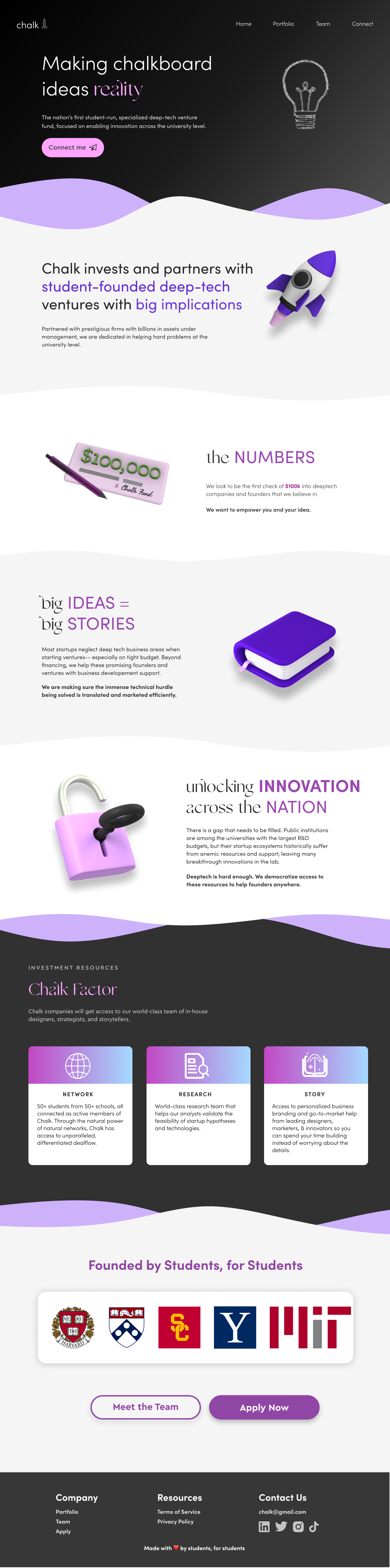
Final Prototype
Our final prototype cleanedup the websites clutter and after a series of user test on students we found this to be the most successful. The palette had a significant change to a much darker theme and the assets were a mix of custom hand drawn assets and 3D assets pulled from free packs on figma and then edited on blender.
![]()
Our final prototype cleanedup the websites clutter and after a series of user test on students we found this to be the most successful. The palette had a significant change to a much darker theme and the assets were a mix of custom hand drawn assets and 3D assets pulled from free packs on figma and then edited on blender.
For a link to the working prototype click here.