Design > Conference Branding
The brand rebrief is as follows:
Students are the primary audience and business leaders, academics and journalists are the primary participants. The brand needs to appeal to this wide ranging audience. We want students to be excited and trust the programming will be cutting edge and new from what’s heard in class. And we want participants to perceive the conference to be prestigious, fresh, and well-organized. We want everybody to expect something new, and know that we take this conference seriously.
The Palette
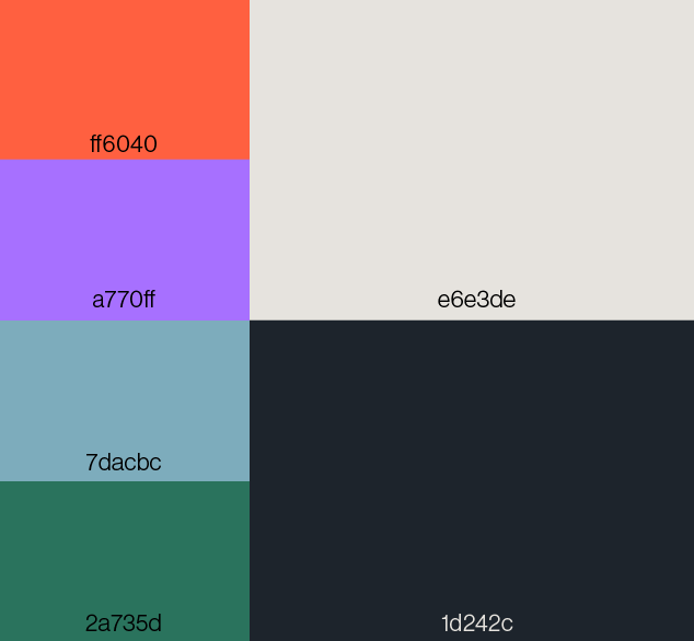
For the palette a number of request by the contracter as well as the brand image were taken into consideration. The conference is highly academic and thus its general audience both older in age and erring on the more professional side. For this reason the palette was decided to be dominated by mostly plain colors for reasons of visibility and neautrality. At the same time a breathe of fresh air was needed to make the conference seem a bit more ‘fun’ while still professional and correspondingly relaying some of the major themes; being tech(purple), nature (green), human(blue), and infrastructure(orange).
For the palette a number of request by the contracter as well as the brand image were taken into consideration. The conference is highly academic and thus its general audience both older in age and erring on the more professional side. For this reason the palette was decided to be dominated by mostly plain colors for reasons of visibility and neautrality. At the same time a breathe of fresh air was needed to make the conference seem a bit more ‘fun’ while still professional and correspondingly relaying some of the major themes; being tech(purple), nature (green), human(blue), and infrastructure(orange).
The Typeface
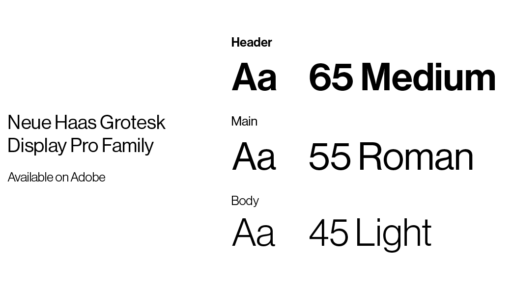
Similar to the previous justifications used for the palette, it was most important that the typeface utilized was highly legible and simple. Additionally the accessibility of the font by the client was another variable taken into consideration at their request so I sought one that could easily be found on Adobe. Neue Haas Grotesk by Christian Shwartz fit this criteria perfectly. Sans Serif as well are contemporary, cutting-edge, and cosmopolitan; all of which are messages the brand wants to relay.
Similar to the previous justifications used for the palette, it was most important that the typeface utilized was highly legible and simple. Additionally the accessibility of the font by the client was another variable taken into consideration at their request so I sought one that could easily be found on Adobe. Neue Haas Grotesk by Christian Shwartz fit this criteria perfectly. Sans Serif as well are contemporary, cutting-edge, and cosmopolitan; all of which are messages the brand wants to relay.
The Logos
Like any great brand, it was imperative that the logo was excellent and executed with precision. The contracters had a plethora of ideas and request about what they wanted and this is where I met my largest hurdle in this project. I was provided a myriad of different reference materials and moodboards for what they wanted their logo to look like; some where simple and 2D, while others where abstract, dynamic, and 3D. It was difficult to create something original yet stilling adhere to the brand ideas. My first iterations were flat marks that used a system of symbols pulled from objects relating to the city theme, a set for technology, a set for nature, and a set for areas/infrastructure. After review the mark was rejected in favor a more ‘cutting-edge’ 3D logo, one that was simple yet still had elements of abstractness and objectivity. For this task I created a 3D model of the logo in blender using an abbreviation of the conference title “Wharton-Weitzman Future of Cities.” For flexibility and variety I created a number of different iterations for the client to use. An illustrated version changed the letters to match city infrastructure: powerlines, buildings, and solar panels. A gradient version that used the color palette with a glass modifier for a more tech oriented approach. And finally two versions that used different heatmaps from building planning and weather forcasting.


The Mark
Mentioned previously, the mark was originally devised to use as the main logo utilizing a handmade symbol system to spell of ‘future cities’. The idea was eventually scrapped at the contracters request but the mark was still used on a number of deliverables such as merchandise and posters.

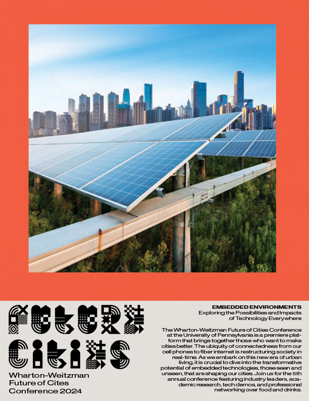
The Posters
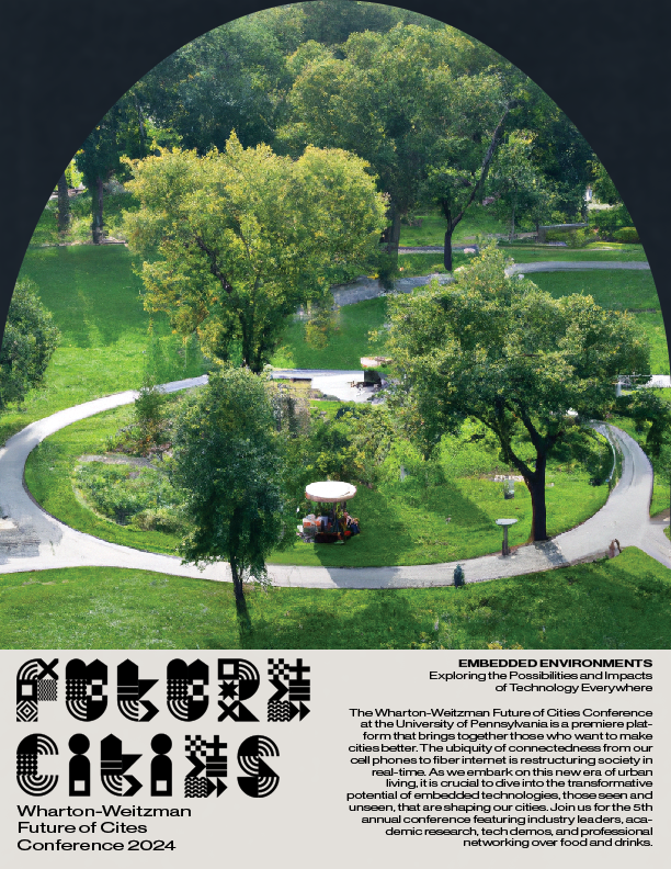
For one of the marketing deliverables these posters were made to put up around campus to call attention to the conference and provide some rudimentary information about the conference such as the mission statement and what the conference provides. The pictures are cropped using symbols from the aforementioned symbol system used on the mark.

The Instagram
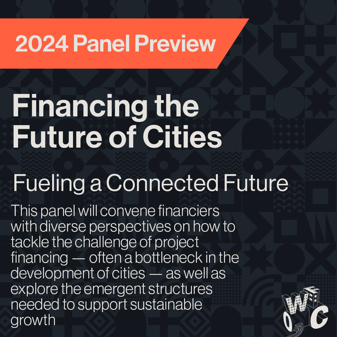
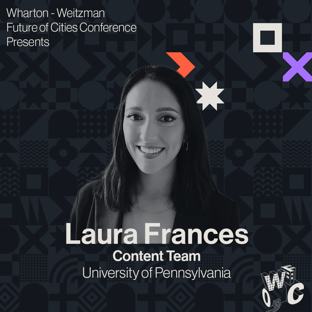
Like any successful branding campaign, it is imperative that the instagram is cohesive and precise. For this component of the brand I weaved together elements such as the symbol system to create a background that remained cohesive with other brand elements as well as the typeface, palette, and logo. Most of all the format of the post are simple so that the client can recreate the content for multiple post and swap out elements to suit their needs.
Like any successful branding campaign, it is imperative that the instagram is cohesive and precise. For this component of the brand I weaved together elements such as the symbol system to create a background that remained cohesive with other brand elements as well as the typeface, palette, and logo. Most of all the format of the post are simple so that the client can recreate the content for multiple post and swap out elements to suit their needs.

The Merchandise
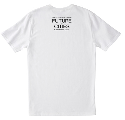
Finallly for the mechandise I created a number of options for the client of small, low-cost, items for them to hand out at the conference. I wanted to merchandise to not only be unique and usable, but recognizable to the point so that other people could immedietly make an association with the conference.
Finallly for the mechandise I created a number of options for the client of small, low-cost, items for them to hand out at the conference. I wanted to merchandise to not only be unique and usable, but recognizable to the point so that other people could immedietly make an association with the conference.


